Analyze data in pivot tables
About the Pivot Table app
With the Pivot Table app, you can create pivot tables based on all available data dimensions in DHIS2. A pivot table is a dynamic tool for data analysis which lets you summarize and arrange data according to its dimensions. Examples of data dimensions in DHIS2 are:
- Data dimension itself (data elements, indicators, events)
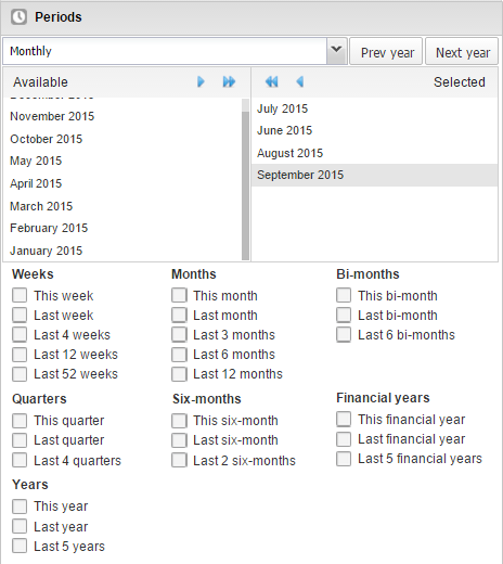
- Periods (time period for the data)
- Organisation hierarchy (geographical location of the data)
From these dimensions, you can freely select dimension items to include in the pivot table. You can create additional dimensions using group sets (e.g., Partner, Facility Type).
A pivot table can arrange data dimensions on columns, rows, or filters.
Tip
- You must select at least one dimension on columns or rows.
- You must include at least one period.
- Data element group sets and reporting rates can't appear in the same table.
- Pivot tables can't exceed the analytic record limit defined in system settings.
- You can drill up/down on period and organisation unit.
Create a pivot table
- Open the Pivot Table app.
- Select dimension items from the left menu.
- Click Layout and arrange columns, rows, and filters.
- Click Update.
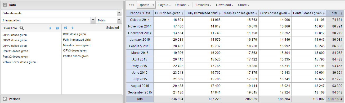
Select dimension items
You can select any number of dimension items under each dimension section.
You must select at least one item before using a dimension.
Data dimension types
| Data dimension type | Definition | Examples |
|---|---|---|
| Indicators | A calculated formula based on data elements. | Immunization coverage. |
| Data elements | Represents the phenomenon for which data has been captured. | Malaria cases; BCG doses. |
| Data sets | A collection of data elements for data collection. Includes reporting rates, actual reports, expected reports, etc. | Reporting rates. |
| Event data items | Data element part of a program event. | Average weight/height. |
| Program indicators | Calculated formula for program events. | Average BMI. |
Periods
- Fixed periods (e.g., January 2012)
- Relative periods (e.g., Last month, Last 12 months, Last 5 years)
Relative periods automatically update when the favorite is viewed later.
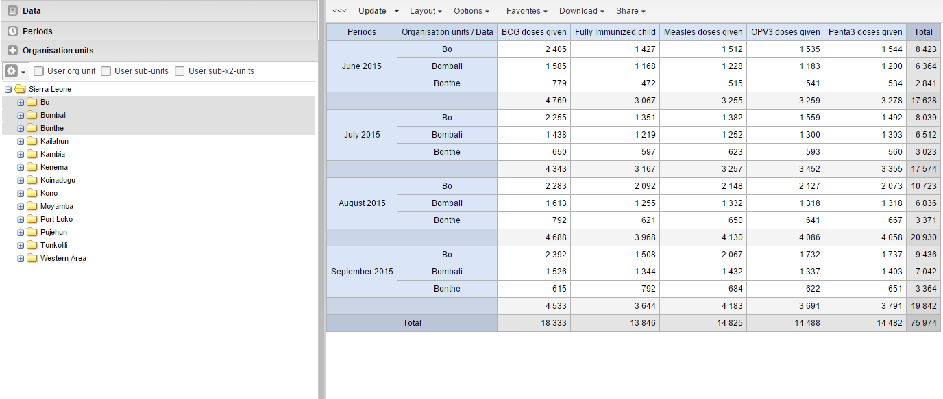
Organisation units
- Select manually or using Select all children
- Use User org unit, User sub-units, User sub-x2-units
- Supports dynamic group sets (e.g., Partner, Facility Type)
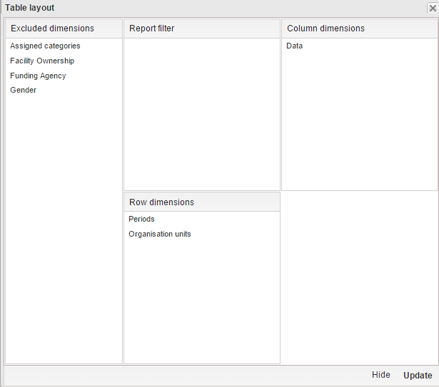
Modify pivot table layout
Click Layout and drag dimensions to:
- Columns
- Rows
- Filters
Change the display of your pivot table
- Open Pivot Table app.
- Create or open a favorite.
- Click Options.
- Set options as required.
- Click Update.
Pivot table options
(Options table omitted for brevity in this demonstration)
Manage favorites
- Open, Save, Rename, Share, Interpret, Subscribe
Download data from a pivot table
- Table layout formats (Excel, CSV, HTML)
- Plain data formats (JSON, XML, CSV, Excel)
- JRXML, Raw SQL export
Embed a pivot table in a web page
Use Embed to copy HTML.
Visualize pivot table as chart or map
- Open table as chart
- Open selection as chart
- Open table as map
- Open selection as map